

7 Typography Rules for a Professional Brand
Introduction
Typography is much more than choosing a beautiful font. The right typography rules can make your business appear trustworthy, professional, and memorable, while poor typography can confuse visitors and reduce customer confidence.
Whether you’re creating a website, social media post, brochure, or logo, following the right typography rules helps your brand communicate clearly and leave a lasting impression.
In this guide, you’ll learn seven simple typography practices that every business should follow to build a professional brand identity.
Why Typography Matters
Typography is one of the first design elements people notice. It influences how customers feel about your business before they even read your content.
Good typography helps you:
- Improve readability
- Build customer trust
- Strengthen brand identity
- Increase user engagement
- Create a professional appearance
Following proper typography practices ensures your message is easy to understand across every marketing platform.
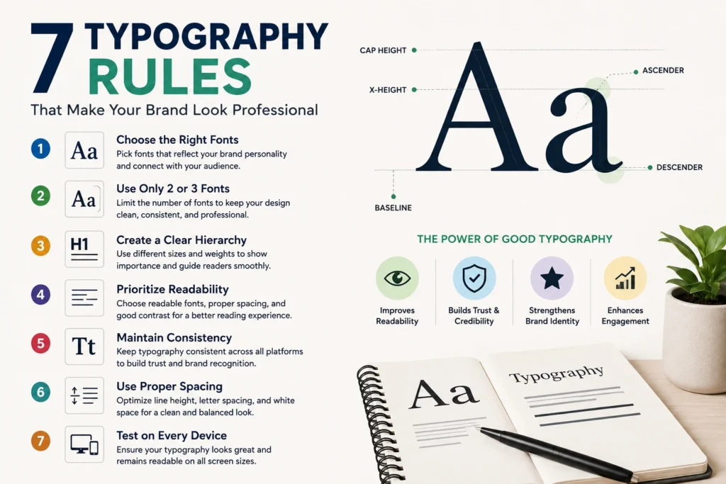
1. Choose Fonts That Match Your Brand
The first and most important typography rule is selecting fonts that represent your business personality.
Different fonts create different emotions.
- Serif fonts feel traditional and trustworthy.
- Sans-serif fonts look modern and clean.
- Script fonts appear elegant but should be used carefully.
- Display fonts attract attention but work best for headings.
Always choose fonts that reflect your brand image instead of following temporary design trends.
2. Limit Yourself to Two or Three Fonts
Using too many fonts makes your design look messy and unprofessional.
A simple combination usually works best:
- One font for headings
- One font for body text
- Optional accent font for highlights
Keeping your typography simple creates consistency throughout your website and marketing materials.
3. Create a Clear Font Hierarchy
Readers should instantly know which text is most important.
A strong hierarchy guides visitors naturally through your content.
For example:
- Large headings
- Medium-sized subheadings
- Comfortable body text
- Smaller captions
A clear hierarchy improves readability and keeps visitors engaged longer.
4. Prioritize Readability Over Style
Beautiful fonts are useless if people struggle to read them.
Always choose:
- Comfortable font sizes
- Proper line spacing
- Good letter spacing
- High contrast between text and background
Avoid decorative fonts for long paragraphs because they reduce reading comfort.
One of the most overlooked design principles is that readability should always come before creativity.
5. Maintain Consistent Typography
Consistency builds trust.
If every page uses different fonts, sizes, and styles, your brand begins to look unorganized.
Create typography guidelines such as:
- Same heading font
- Same paragraph font
- Same font sizes
- Same spacing rules
- Same text colors
Professional brands maintain consistent typography across websites, social media, presentations, and advertisements.
6. Use Proper Spacing
Spacing plays a major role in professional design.
Even great fonts can look poor when text is crowded together.
Pay attention to:
- Line spacing
- Letter spacing
- Paragraph spacing
- White space around text
Proper spacing makes content easier to scan and gives your design a clean, modern appearance.
7. Test Typography on Every Device
Your typography should look great on desktops, tablets, and smartphones.
Before publishing, always check:
- Font size on mobile
- Heading alignment
- Line breaks
- Button text
- Overall readability
Responsive typography improves user experience and helps visitors stay longer on your website.
Examples of Typography Rules in Popular Brands
Many successful companies follow strong Typography Rules to create a consistent and recognizable identity. Brands like Google, Apple, and Airbnb use clean, readable fonts that reflect their personality and values. Luxury brands often choose elegant serif typefaces to communicate sophistication, while technology companies prefer modern sans-serif fonts to create a clean and innovative appearance.
The key lesson is not to copy another brand’s style but to understand why their typography works. A consistent font family, clear hierarchy, proper spacing, and readable text help customers recognize a brand instantly. Applying the right Typography Rules across your website, advertisements, presentations, and social media strengthens your visual identity and creates a professional customer experience.
How to Apply Typography Rules to Your Website
Your website is often the first place customers interact with your business, making typography one of the most important design elements. Following effective typography practices improves navigation, keeps visitors engaged, and makes information easier to understand.
When designing your website:
- Use one font style for headings and another for body text.
- Keep body text between 16–18 pixels for comfortable reading.
- Maintain consistent heading sizes throughout every page.
- Leave enough white space between paragraphs and sections.
- Choose colors that provide strong contrast between text and background.
- Avoid writing long blocks of text without headings or bullet points.
These simple practices create a cleaner layout and encourage visitors to stay on your website longer.
Why Consistency Matters in Typography ?
Consistency is one of the most important Typography Rules because it creates familiarity and trust. When customers see the same font styles, spacing, and text hierarchy across your website, social media posts, brochures, and marketing materials, they begin to recognize your brand more easily.
Inconsistent typography can make even a well-designed business appear unprofessional. Using different fonts on every page, changing heading styles frequently, or applying inconsistent spacing can confuse readers and weaken your brand identity. By creating simple typography guidelines and following them across every platform, businesses can present a polished, professional image while improving readability and customer confidence.
Common Typography Mistakes to Avoid
Many businesses unknowingly make typography mistakes that weaken their brand image.
Avoid these common errors:
- Using too many fonts
- Choosing fonts that are difficult to read
- Making text too small
- Ignoring spacing
- Using inconsistent heading styles
- Writing long paragraphs without proper formatting
- Using low-contrast text colors
Avoiding these mistakes will instantly improve your overall design quality.
Benefits of Following Typography Rules
Implementing proper typography practices offers long-term advantages for your business.
Some key benefits include:
- Better user experience
- Higher content readability
- Stronger brand identity
- Increased customer trust
- More professional marketing materials
- Improved website engagement
- Better visual consistency
Small typography improvements often create a significant impact on how customers perceive your business.
Conclusion
Typography is one of the most powerful elements of graphic design. Following these seven typography rules helps create a brand that looks polished, trustworthy, and easy to recognize.
You don’t need expensive design software or advanced skills to improve your typography. By choosing the right fonts, maintaining consistency, improving spacing, and focusing on readability, you can make every piece of content look more professional.
Start applying these typography rules today, and your brand will make a stronger first impression on every customer.
Professional typography improves readability, strengthens visual communication, builds customer confidence, and creates a more consistent brand experience across every marketing channel.
Frequently Asked Questions (FAQs)
What are typography rules?
Typography rules are design guidelines that help you choose, organize, and display text in a way that improves readability, consistency, and brand identity.
How many fonts should a business use?
Most professional designers recommend using two or three fonts to maintain a clean and consistent appearance.
Why is typography important in branding?
Typography influences how customers perceive your business. Good typography builds trust, improves readability, and creates a memorable brand identity.
Which font type is best for business websites?
Sans-serif fonts are commonly used because they are clean, modern, and highly readable on digital screens.
Can typography affect user experience?
Yes. Clear typography makes content easier to read, improves navigation, and encourages visitors to stay on your website longer.
