

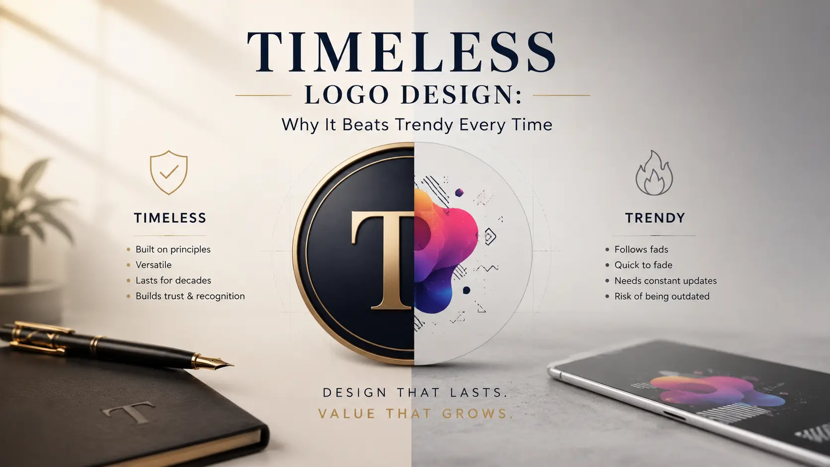
Timeless Logo Design: Why It Beats Trendy Every Time
Timeless logo design is one of the most undervalued investments a business can make. Every year, new design trends emerge — gradients, hand-drawn fonts, 3D effects, minimalism, maximalism — and businesses that chase each one end up redesigning their logo every couple of years, spending money repeatedly on something that should have lasted decades. Understanding what actually separates a timeless logo from a trendy one can save your business significant time, money, and brand confusion.
Why This Distinction Matters So Much
Many business owners don’t think carefully about the difference between timeless and trendy design until they’re staring at a logo that suddenly looks dated. Timeless logo design isn’t about avoiding modern aesthetics entirely — it’s about building a mark that doesn’t depend on a passing visual trend to feel relevant. According to Google’s brand design research through Think with Google, consistent, recognizable branding significantly increases consumer trust over time, and constant redesigns work directly against that consistency.
What Actually Makes a Logo “Trendy”
Trendy logos are built around whatever visual style is popular at the moment — a specific gradient combination, an overly stylized font, or an effect that feels fresh today but instantly signals “this was made in [specific year]” a few years later. Trend-driven design choices often prioritize looking current over looking distinctive, which is exactly why they age poorly. A logo built entirely around 2020s gradient trends, for example, will likely feel outdated by the late 2020s the same way logos from the early 2000s now feel tied to that specific era.
What Actually Makes a Logo Timeless
Timeless logo design relies on simplicity, strong conceptual foundations, and visual choices that aren’t tied to a specific moment in design history. Logos like Nike’s swoosh, Apple’s apple, or McDonald’s golden arches have remained recognizable for decades not because they avoided all modern touches, but because their core design didn’t depend on trend elements to communicate meaning. These logos work as well in black and white, at small sizes, and across any medium — a strong indicator of genuinely timeless design.
Simplicity Is the Foundation, Not an Accident
One of the clearest patterns among logos that have lasted decades is simplicity. Complex designs with intricate details, multiple colors, or elaborate typography tend to look impressive briefly but age faster and perform worse across different applications — from a tiny app icon to a large storefront sign. Timeless logo design almost always starts with a concept simple enough to be instantly recognizable, memorable, and reproducible at any size.
Typography Choices Matter More Than Most Businesses Realize
Fonts carry strong stylistic signals tied to specific design eras. Ultra-thin, heavily stylized, or highly decorative fonts often feel fresh initially but date quickly as typography trends shift. Classic, well-balanced typefaces — whether serif or sans-serif — tend to age far more gracefully because they aren’t tied to a specific visual movement. This is one of the most overlooked factors in timeless logo design, since typography often changes trend cycles faster than color or iconography.
Color Choices Should Support Longevity
While color palettes do shift in popularity over time, timeless logos tend to rely on strong, purposeful color choices rather than whatever palette is currently trending on design platforms. Overly saturated gradients or hyper-specific trend colors can quickly tie a logo to a particular era. Choosing colors based on brand meaning and psychological association, rather than current aesthetic popularity, supports a longer design lifespan.
Avoid Designing Around Specific Effects
Certain visual effects — drop shadows, bevels, specific gradient styles, glassmorphism, or 3D rendering techniques — tend to be closely associated with particular design periods. A logo that leans heavily on one of these effects as its core identity risks becoming instantly dated once that particular style falls out of favor. Timeless logo design treats these effects, if used at all, as secondary touches rather than the defining feature of the mark.
Versatility Across Applications Is a Strong Test
A genuinely timeless logo needs to work everywhere — on a website favicon, a large banner, embroidered on a uniform, printed in black and white, or displayed on a mobile app icon. Trendy logos often struggle with this kind of versatility because their defining features (intricate gradients, small text details, complex layering) don’t translate well across different sizes and formats. If a logo only looks good in one specific context, it’s a strong sign that trend-driven elements are doing too much of the work.
The Financial Cost of Chasing Trends
Redesigning a logo isn’t just a design expense — it involves updating packaging, signage, business cards, digital assets, social media profiles, and marketing materials across every platform. Businesses that chase trends every few years often spend significantly more over a decade than those who invest once in timeless logo design and make only minor refinements over time. This hidden cost is rarely factored in when a trendy design initially feels like the exciting, modern choice.
The Brand Recognition Cost of Frequent Redesigns
Beyond direct financial cost, frequent redesigns quietly damage brand recognition. Every time a logo changes significantly, a business essentially resets a portion of the visual recognition it has built with its audience. Consistency over time is one of the strongest, most underrated drivers of brand trust, and constant trend-chasing works directly against it.
How to Evaluate a Logo Concept for Longevity
Before finalizing a logo, it’s worth asking a few key questions: Does this design rely on a specific color trend, font style, or visual effect that’s currently popular? Would this logo still make sense and look intentional if trends shifted significantly in five years? Does it remain clear and recognizable in black and white, at a small size, and across different formats? Honest answers to these questions reveal whether a design leans toward genuine timeless logo design or whether it’s likely to feel dated sooner than expected.
When It’s Okay to Refresh, Not Redesign
Timeless doesn’t mean completely static. Many long-lasting brands do make subtle refinements over the years — slightly modernizing proportions, simplifying details, or adjusting color saturation — without abandoning the core concept. This is different from a full redesign chasing a new trend; it’s a refinement that keeps a strong foundation feeling current without sacrificing recognizability built up over years or decades.
Why This Matters More for Small and Growing Businesses
Larger, established brands can sometimes absorb the cost and risk of a redesign more easily than smaller businesses still building initial recognition. For small and growing businesses, investing in timeless logo design from the start avoids the compounding cost of multiple redesigns during a critical growth period, while also building consistent brand recognition faster than a business that changes its visual identity every couple of years.
Final Thoughts
Timeless logo design isn’t about avoiding modern design entirely — it’s about building a visual identity that doesn’t depend on a passing trend to feel relevant. Simplicity, versatile typography, purposeful color choices, and avoiding trend-specific effects all contribute to a logo that remains effective for decades rather than years. Businesses that prioritize this approach from the start save significant money, avoid brand recognition setbacks, and build stronger long-term trust with their audience.
Looking for a logo built to last, not just look good this year? Explore our graphic design services for a brand identity designed around longevity, not trends.
Frequently Asked Questions
What’s the main difference between a timeless and a trendy logo? A timeless logo relies on simplicity, strong conceptual foundations, and design choices that aren’t tied to a specific era, while a trendy logo leans heavily on currently popular colors, fonts, or effects that tend to date quickly once trends shift.
Does timeless logo design mean avoiding modern elements entirely? No. Timeless design can absolutely feel modern; it simply avoids depending on specific trend elements — like a particular gradient style or overly decorative font — that will feel outdated within a few years.
How often should a business redesign its logo? Businesses with genuinely timeless logos often go decades with only minor refinements, while those that chase trends may find themselves redesigning every two to three years, incurring significant repeated costs.
Are simple logos really more effective than detailed ones? Generally, yes. Simple logos tend to be more recognizable, more versatile across applications, and easier to reproduce at any size, which is a major reason so many long-lasting brand logos are relatively simple in design.
Why do frequent logo redesigns hurt a brand? Every significant redesign resets some portion of the visual recognition a business has built with its audience over time, since consistency is one of the strongest drivers of brand trust and recall.
How can I tell if my current logo is trend-dependent? Ask whether your logo relies heavily on a specific color trend, decorative font, or visual effect that’s currently popular. If removing that element would make the logo feel incomplete or generic, it likely leans more trendy than timeless.
Is it more expensive to invest in timeless logo design upfront? It can cost slightly more initially due to the additional strategic thinking involved, but it typically saves significant money over time by avoiding the cost of multiple redesigns and their associated rebranding expenses across all business materials.
